416 441 2666 | Toll Free: 1 855 582 7263
Mystique Brand Communications
  • Home
  • Why Mystique
  • Brand Services
    • BRAND STRATEGY
      • Market Research
      • Brand Audits
      • Brand Positioning
      • Brand Architecture
      • Brand Naming
    • BRAND DEVELOPMENT
      • Corporate Identity Design
      • – Logo Design
      • – Written Identity
      • Website Design
      • Graphic Design
      • Package Design
    • BRAND BUILDING
      • Lead Generation
      • – SEO
      • – Pay Per Click Marketing
      • – Reputation/ Review Management
      • Direct Marketing Toronto
      • – Trade Show Support
      • Customer Engagement
      • – Social Media
      • – Email Marketing
      • – Marketing Automation
    • BRAND MANAGEMENT
      • Brand Metrics
      • ROI and Analytics
  • Portfolio
    • Logo Design
    • Corporate Identity Collateral
    • Small Business Website Design Services
    • Package Design Toronto
    • Direct Mail
    • Event Collateral
    • Promotional Items, Awards, Plaques & Incentives
  • Brand+Aid Blog
  • Contact
Select Page

Rebranding the Nets

brand company toronto

With the New Jersey Nets finally making their move to Brooklyn next season, the organization recently unveiled the storied franchise’s rebrand.

Voila, and there it is.

brand companybrand company
I’m really not sure how I feel about it. The minimalist in me completely appreciates the simplified design approach but at the same time I feel that in some iterations of the logo – it almost looks oversimplified to the point of feeling rather unfinished and lazy. I’m specifically referring to what looks like the primary team logo (with the crest). If it were up to me, I would’ve made a complete departure from the crest – which feels like a rather forced artefact from the New Jersey era. I think it only makes sense since the team is entering a new chapter in its history.

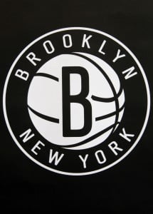
I can say however, I do love the circular logo because of its vintage quality – not to mention the shape better lends itself to the B & ball imagery. In keeping with the minimalistic approach, their colour palette seems to only comprise of black and white. This makes Brooklyn a unique team as no other team in the league currently utilizes only a black and white palette (San Antonio is close but they also use silver).

I’m pretty excited to see how the rebrand is applied to the team jerseys and court design.

rene tan
Rene Tan
Graphic Designer
Mystique Brand Communications

If a rebrand is what your business needs, creating a plan is Step One.

Use the Mystique Rebranding Checklist to plan for success.

GET IT NOW

RECENT POSTS

  • Internal vs External Marketing: The Best Choice for Your SMB
  • Eight tricks to help you with search engine optimization (SEO) in 2023
  • 2022 Best of Ontario B2B Award Winner by UpCity!
  • One of the Most Reviewed PPC Companies in Toronto
  • “Branding Gone Wrong”- That’s Our Idea of a Scary Halloween!

CONTACT US

Looking to revitalize your brand or create a new one? Let’s talk. Start the conversation by filling in the contact form below.

CATEGORIES

get-more-reviews-ad

Copyright © 2023 Mystique Brand Communications. All Rights Reserved | TORONTO’S TOP BRANDING AGENCY FOR SMALL AND MEDIUM BUSINESSES WITH A FOCUS ON GROWTH | Terms and Conditions | Privacy Policy