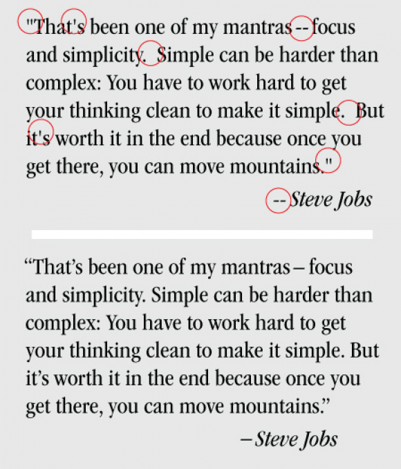
Bad type? Often we see supplied text that has been incorrectly set for print and the web. Most graphic designers are aware of ‘proper’ practices with the use of such items as ‘smart quotes’ and apostrophes, as well as em and en dashes. See the sample (above) for the correct settings. One of the major problems is the receipt of client-supplied manuscripts with double spaces. Most desktop applications have tools that work out these kinks, but not so for websites.
Unless it is an alphabetical character or number, typographical symbols are represented by a mix of gibberish html code. Remember these simple notes the next time you send or receive a manuscript, it’ll save a lot of editing time.

Frank Beecham
Mystique Brand Communications

